The Prize Nobody Won: When a Strong Illustration Fails as a Magazine Cover
AICU withheld the grand prize in its Halloween contest because none of the entries worked as a printed cover. The published judging notes describe a design problem every AI creator hits: the placement sets the composition.
AI-assisted draft. Reviewed and edited by the Phosphene team before publication.
On this page
A contest jury deciding not to award a first prize is unusual. When it happens in an art contest, the reflex is to assume the entries were weak. The published judging notes from AICU's Halloween illustration contest point somewhere more useful: the entries were strong enough to be named runners-up, and none of them worked as the thing the prize was actually for.
The brief was to make a magazine cover.
What the contest asked for
AICU, a Japanese AI media outlet, ran contest C2609 as a release event for GPT-Image-2.5. The theme was original-character cosplay crossed with Halloween, and the company made GPT-Image-2.5 available to entrants through its own creation tool.
The submission spec was explicit in a way that illustration briefs usually are not:
- 2000 by 3000 pixels, B5 portrait format
- leave margin at the top and bottom
- the reason for that margin: the magazine title and the issue information would be placed there
The grand prize was the cover of AICU Magazine Vol.29 with a small cash award attached. Runners-up and finalists got a certificate, a recommendation into the outlet's international creator award, and space in the magazine.
Then the jury announced that no grand prize would be given, and the editorial team made the cover in-house instead.
Unattractive is not the same as unusable
The jury's explanation is worth reading closely, because it separates two things that get bundled together constantly in AI image work.
The award was not for the most attractive illustration. It was for the front cover of a physical and digital magazine. So the criteria stacked: the cosplay theme had to read clearly, the main character had to hold the frame in a tall B5 layout, there had to be room for a masthead and a title without burying the art, and the file had to carry enough resolution and composition to survive print. The outlet also had a retail platform review to pass, plus its own sense of what belongs on a shelf next to the magazine's stated mission.
That is a long list, and the entries satisfied parts of it. Their conclusion was plain: being an appealing illustration and being a functioning cover are different tests.
The most concrete example is group composition. A horizontal illustration with five characters on a stage is a perfectly good image on a wide canvas. On a tall cover, those five characters get smaller than the eye wants, each face loses its read, and nobody in the frame is obviously the subject. The same file that looks confident in a social feed looks like a crowd on a magazine.
There is a second failure mode in the same family. Painting one large expressive face is a common strong move, and it is the wrong move when a masthead will be overlaid on the top of that face. The editor places type where the composition leaves room, and if there is no room, the art and the type fight.
What the judges told the three runners-up
The three published critiques are more instructive than the no-award decision, because each one names the specific craft gap.
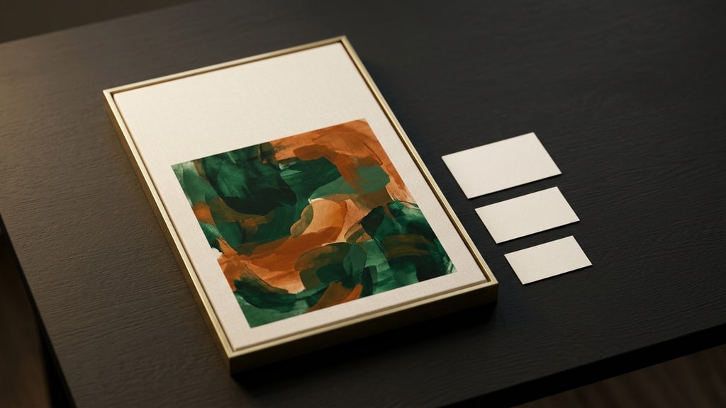
Color as the subject. One piece built its composition around green and orange contrast, which is legible Halloween shorthand and a genuinely strong choice for a feed. The critique asked for the next step: treat the character's presence, the background palette, and the text zone as one design on the vertical canvas, so the colors carry a cover rather than only a picture.
The five-character stage. This one was praised for ambition and then taken apart for hierarchy: decide which character owns the frame, control the order the viewer's eye travels, and decide where the title goes. The judges also asked for character names, roles, and costume concepts, because that gives a viewer a way into the world. That last note matters for AI creators specifically. If your characters have defined personas and assets, showing them off costs you almost nothing and makes the piece readable to someone who did not generate it.
The magic-academy student. Here the judges found the story hook and pointed at what was left on the table: expression and gaze. Eye direction, a small change at the mouth, and where the light falls on the face change the impression more than a redesigned costume. A richly imagined setting does not do the work a face does.
The translation for AI work: generate for the placement
Most of this is ordinary art direction that predates AI. The reason it keeps biting AI creators is that generation makes it easy to produce a beautiful object at the wrong size with the wrong empty space in the wrong corner.
The fix is to define the destination before the prompt:
- Write down the placement: trim size, aspect ratio, minimum resolution, and what will sit on top of the image. If a masthead is going at the top, say so in pixels before generating.
- Describe the empty space in the prompt, not just the subject. "Large calm sky in the upper third" is a composition instruction. The model will honor it more often than a vague request for a good layout.
- Generate at or above target resolution. Upscaling a 1K render to a 2000 by 3000 print file adds size, not detail, and print is where that shows.
- Check it at thumbnail size. A store listing shows your cover small, so the focal point has to survive at roughly 100 pixels wide. If it does not, the composition is a feed image, not a cover.
- Mock the text before you finalize. Drop a grey block where the title goes, then look at whether any important element is now hidden. Type over an eye is a rejected cover, not a style choice.
- For group shots, name the focal character in the prompt and put them first, then keep the group small in a portrait frame. Five subjects side by side is a wide-frame move; three stacked with a clear lead is a cover move.
- Keep the cover master and the post master separate. One image rarely serves both, and trying to make it do both is how you end up with a mediocre store thumbnail.
Those steps sound like bureaucracy until you have shipped a piece you loved to a placement that could not use it.
What the withheld prize actually says
Reading the decision as an insult to the entrants misses the point. The outlet published its criteria, judged against them, and declined to lower the bar because the deadline was close. That is what a professional editorial process looks like, and the entrants got something a friendly win would not have given them: a precise list of what to fix.
If you make images for a living, the lesson generalizes past magazine covers. Ask what the image is for before you ask what it should look like, and treat the answer as part of the brief. A poster that has to survive being printed at A2, a thumbnail that has to read at 100 pixels, and a character sheet that a second artist has to match are three different deliverables, and the same generation settings will not serve all three. If you want the anti-pattern in its purest form, the posters people hate are usually the result of generating a striking object with no placement in mind. Judging craft as a process rather than as a single impressive output, which creative awards are starting to do, points the same direction.
One more detail from the announcement is a nice illustration of the same principle. The contest organizers had a fixed 2000 by 3000 spec, and the cover that eventually shipped came from the editorial team working to that spec from the start, masthead space and all. The constraint was never a surprise. It was in the brief.