AI Poster Collage: A Layer-by-Layer Workflow
Build an AI poster with a clear layer stack, readable composition, and a consistent character. Includes a reusable brief and an illustrated review checklist.
AI-assisted draft. Reviewed and edited by the Phosphene team before publication.
Lock the character identity first. Place one dominant shape, then add typography and texture around the face. Change layout between variants while keeping the eyes, hair, face structure, and clothing consistent.
On this page
- The principle: prompt the design language before the image
- See the layer decisions
- Start with the art-director brief
- Build the poster as layers, not decoration
- Character consistency is the hard part
- Poster workflow in Phosphene
- Use an AI design partner for research, not taste replacement
- A reusable prompt pattern
- 1. Identity lock
- 2. Poster job
- 3. Graphic system
- 4. Layer placement
- 5. Negative constraints
- 6. Variant rule
- What to save after a good result
- The takeaway
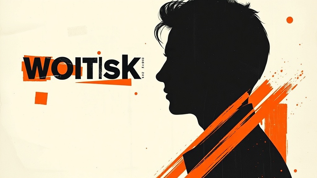
Most AI poster prompts fail because they describe the final surface without designing the system underneath it.
A creator asks for a "bold editorial poster with typography, ink, scratches, and a cinematic portrait." The model gives back something that looks energetic for three seconds, then falls apart: fake readable text, decorative chaos, weak hierarchy, a character that changes between variants, and texture sprinkled on top instead of integrated into the composition.
The fix is not a longer pile of adjectives. The fix is to treat the image model like the renderer, not the designer. The design work happens one layer earlier, where an AI design partner helps you define the visual grammar before you generate.
That is the interesting pattern in the Japanese workflow that inspired this article: the human acts as art director, the language model acts as a design collaborator, and the image model executes a tightly structured poster brief.
The principle: prompt the design language before the image
For graphic poster work, the useful question is not only "what should the image show?"
The better question is:
What visual languages are colliding inside this image, and what rules keep the collision intentional?
In the source workflow, the creator builds a poster direction around several design traditions: photomontage, Constructivist diagonals, New Typography, Bauhaus-era photo/text integration, fragmented postmodern type, risograph texture, silkscreen ink, halftone dots, scratches, paper grain, and rough brush marks.
That list matters. It gives the AI design partner a vocabulary to reason with. Without it, the model defaults to shallow style labels: "modern," "bold," "edgy," "poster design." Those words are too soft. They do not tell the image model where to place the red band, how typography should collide with the face, or why the paper texture exists.
A stronger workflow separates three jobs:
- Define the design vocabulary.
- Convert that vocabulary into a structured image brief.
- Generate variants while locking the character identity.
If you skip the first job, the poster becomes decoration.
See the layer decisions
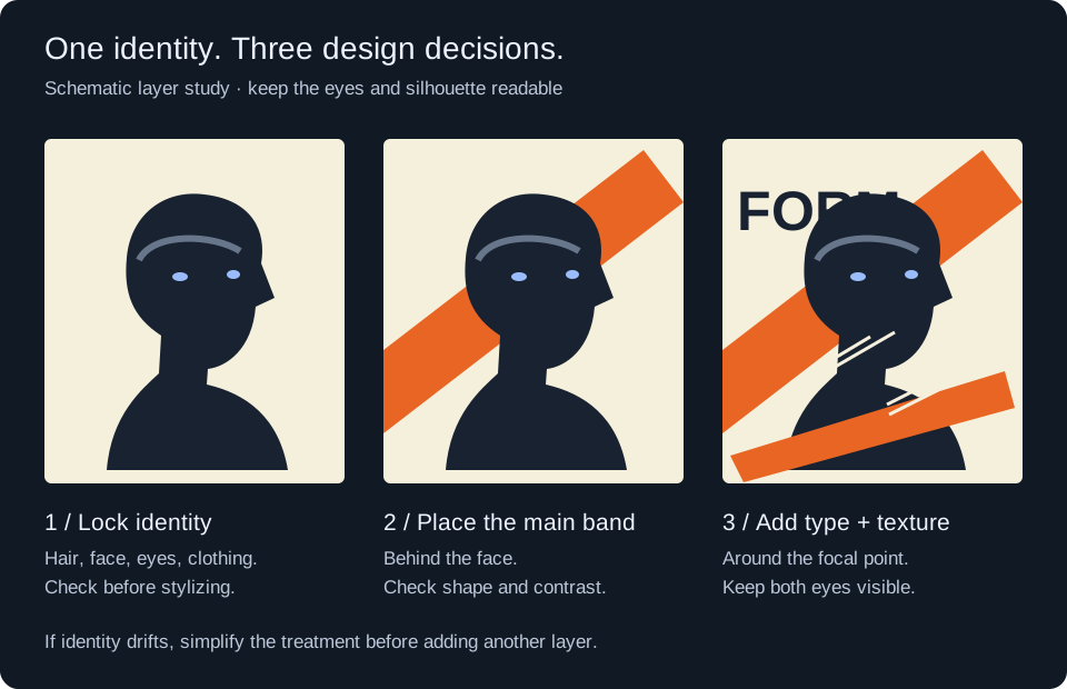
Original teaching diagram by Phosphene, September 2026. This constructed layer study illustrates the brief; it is not a generated result or a claim about a particular model.
| Stage | Instruction to try | What to inspect before continuing |
|---|---|---|
| Identity | Keep the supplied face, hair silhouette, and clothing. | Compare the reference and result side by side. Stop if identity has changed. |
| Composition | Place one orange diagonal band behind the face. | The band should support the portrait without covering the eyes. |
| Finish | Add cropped type fragments and localized print texture. | Inspect the eyes, letter edges, and texture at the intended export size. |
If a result is busy, remove a layer before adding more prompt text. If lettering must be exact, set and proofread the final typography in a layout editor; a decorative type fragment is not reliable typesetting.
Start with the art-director brief
Before asking for an image, write the poster as if you were briefing a junior designer.
Not like this:
Cool punk editorial poster, black and red, dynamic typography, cinematic character, grunge print texture.
That is a vibe. It gives the model permission to improvise everything.
Use a brief like this instead:
Create a square editorial graphic poster from the supplied character reference. Treat the person as one material inside the page, not as a clean beauty portrait. Combine black-and-white photographic face treatment, cropped black sans-serif letter fragments, red-orange diagonal blocks, dry brush marks, off-white paper, halftone dots, scratches, torn paper edges, uneven ink coverage, and slight risograph-style misregistration. Keep both eyes visible. Preserve the hair silhouette, face structure, clothing colors, and signature accessory from the reference.
The difference is control. The second brief gives the model both composition and constraints.
It also makes the key tradeoff explicit: the character can be integrated into the poster, but identity markers cannot drift.
Build the poster as layers, not decoration
A good AI poster prompt should read like a layer stack.
For this style, the stack can be:
- Off-white paper base with visible grain.
- Black photographic portrait treatment.
- Red-orange diagonal block behind the face.
- Large cropped black letter fragments behind and in front of the figure.
- Dry brush marks behind the head.
- Scratches and ink distress along the silhouette.
- Halftone dots and small black rectangle blocks to create rhythm.
- Uneven ink and slight color misregistration to make it feel printed.
This is where many AI images go wrong. They add "texture" after the poster is already composed. That usually looks like a filter.
The better instruction is positional:
Put one red-orange diagonal band behind the face and one near the lower edge. Place some black letter fragments behind the shoulders and some overlapping the lower face area, but do not cover the eyes. Let white scratches and ink distress interact with the character outline.
That tells the model how elements relate to each other. Relation beats adjectives.
Character consistency is the hard part
Poster collage invites distortion. The model wants to crop, cover, stylize, and remix the face. That is useful for graphic energy, but dangerous if you need a repeatable character system.
So split the prompt into locked traits and variable traits.
Locked traits:
- face structure
- eye shape
- hair silhouette
- hair color
- clothing color
- important accessory
- approximate age and character type
Variable traits:
- crop
- angle
- poster layout
- red band placement
- type fragment placement
- brush mark shape
- halftone density
- paper distress
A useful variant instruction is:
For each generation, vary the red-orange bands, cropped black letter fragments, brush marks, halftone dots, cutout position, scale, angle, and crop. Preserve the same character identity.
That single sentence is doing real production work. It tells the system what is allowed to move and what must stay stable.
Poster workflow in Phosphene
In Phosphene, build this as a controlled tag stack instead of one giant prompt blob.
Start with the subject layer:
- character identity
- face/hair markers
- outfit material
- signature accessory
Then add the design language layer:
- photomontage
- editorial poster
- Constructivist diagonal composition
- fragmented typography
- risograph print texture
- silkscreen ink
- paper grain
Then add the composition layer:
- centered close-up
- cropped upper body
- red-orange diagonal band
- large black sans-serif fragments
- both eyes visible
- no readable words
The advantage is not just cleaner prompting. The advantage is iteration. In Phosphene, you can keep the subject tags stable while testing only the design-language tags. If the character starts drifting, you know the problem is not the whole prompt. It is likely the collision between identity constraints and the poster-style layer.
That makes the workflow debuggable.
Use an AI design partner for research, not taste replacement
The strongest role for a language model here is not "make a cool prompt."
The stronger role is:
Act as a graphic design collaborator. Analyze the intended visual language, identify the relevant design traditions, convert them into concrete composition rules, then write a generation brief that preserves character identity while allowing layout variation.
This is where a model with deeper design reasoning can help. It can remind you that red/black diagonals and compressed typography are not random cyberpunk decoration. They carry references to Constructivism, New Typography, propaganda posters, music flyers, fashion editorials, and print production artifacts.
But the human still has to judge the output. The model can propose a vocabulary. It cannot decide whether the poster has taste, hierarchy, or brand fit.
A good human review pass asks:
- Does the face still belong to the same character?
- Are the letters graphically strong without becoming fake readable text?
- Is the red band creating structure or just noise?
- Does the print texture feel physical, or like a grunge overlay?
- Is there one clear focal point?
- Would this work as a cover, thumbnail, album visual, or campaign asset?
If the answer is no, do not add more style words. Tighten the layer rules.
A reusable prompt pattern
Use this structure when you want poster variants from a character reference.
1. Identity lock
Use the supplied character reference as the identity source. Preserve the face structure, eye shape, hair silhouette, hair color, outfit colors, material language, and signature accessory. Do not turn the output into a character sheet, turnaround, comparison panel, or full-body catalog pose.
2. Poster job
Create one square editorial graphic poster. Treat the character as a photographic material inside the page composition, not as a clean standalone portrait.
3. Graphic system
Use off-white paper, black-and-white photographic face treatment, cropped black sans-serif letter fragments, red-orange diagonal blocks, dry brush marks, white scratches, ink scuffs, torn paper edges, halftone dots, small black rectangle blocks, uneven ink coverage, visible paper grain, and slight risograph-style color misregistration.
4. Layer placement
Place one red-orange diagonal block behind the face and one near the lower edge. Put some black letter fragments behind the shoulders and some overlapping the lower face or clothing area, but keep both eyes visible. Let scratches and ink distress interact with the character outline. Crop some shapes at the page edge.
5. Negative constraints
No readable words, no logo, no watermark, no beauty portrait, no soft pastel illustration, no anime cel-shading, no indoor background, no landscape background, no fashion catalog layout.
6. Variant rule
Across variants, change the red bands, type fragments, brush marks, halftone dots, crop, scale, and angle. Keep the character identity stable.
This prompt pattern is intentionally modular. You can swap the design language without rewriting the entire brief.
For example, replace Constructivist collage with Swiss grid, Japanese magazine typography, brutalist club flyer, Y2K interface poster, luxury fashion editorial, or handmade zine. The subject lock stays the same. The design layer changes.
What to save after a good result
Do not only save the final image. Save the structure that made it work.
For Phosphene users, that means saving:
- the subject tag stack
- the design-language tag stack
- the composition constraints
- the negative constraints
- the best prompt block
- the reference image used for identity
- the model that handled the typography/texture balance best
This turns one poster into a repeatable visual system. You can make a set of covers, character cards, social posts, music visuals, or campaign thumbnails without restarting from zero every time.
The real product value is not one impressive generation. It is a poster system that can survive variation.
The takeaway
AI graphic design gets much better when you stop asking the image model to invent art direction in one pass.
Use a language model as a design partner to research the visual vocabulary, turn that vocabulary into layer rules, and define what can vary. Then use the image model to render controlled variants. In Phosphene, keep those choices separated as subject, style, composition, and constraint tags so you can debug the image instead of guessing which phrase broke it.
That is the shift: not "AI makes a poster," but "AI helps operate a poster system."